Overview
|
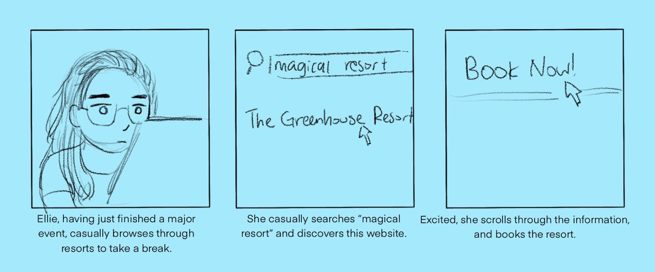
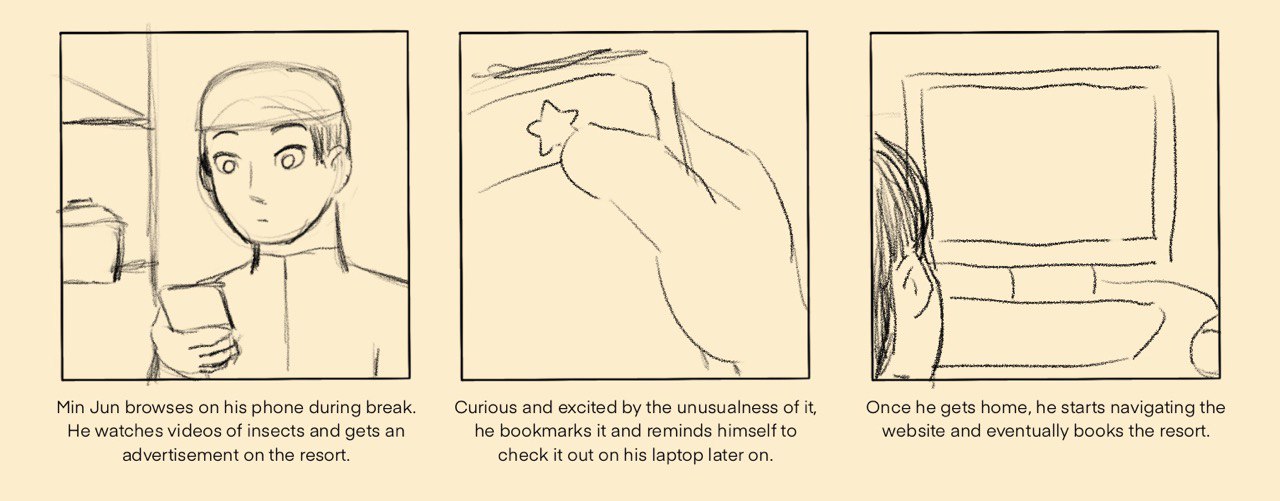
During my study in UQ, I designed a resort website with the prompt of a unique location and activity - I chose to design a greenhouse resort where visitors get to ride on butterflies. I used a desktop-first approach for the website, before doing a mobile version of it. The tablet and desktop versions are similar.
I've also made the website accessible for keyboard-only computers for the navigation by making the navigation clickable rather than hoverable. Below is a summary of testing I did in order to get to the final design. Languages used: HTML, CSS, JavaScript, jQuery |
Personas
|
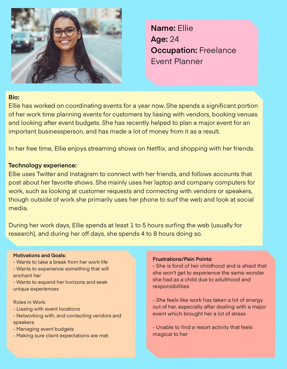
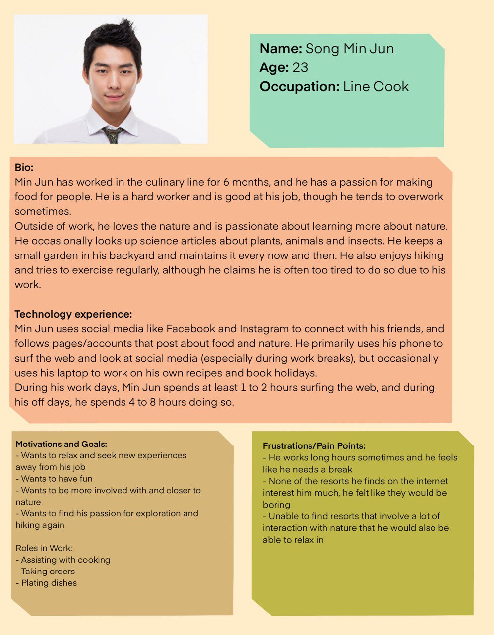
Personas are created in order to pinpoint the target audience of the website. In this case, the target audience is 18-25 year old nature lovers and thrill seekers.
|
Card Sort User Testing
|
Due to COVID-19 and classes transitioning online, I used Trello to do open card sort user testing (where users give their own category titles to each card) in order to let users determine the information architecture and navigation of the website. I tested with other UQ IT students who happen to be designers, and happen to fall with the target audience of the demographic.
|
Low-fi User Testing
|
Approach: Think aloud, interview (qualitative)
For the testing plan, I gave the users the following tasks to do in Zoom: a. How to find out what the resort looks like b. Find out more about the attractions c. How to book a room d. How to ask a question e. How to find out about the reviews f. How to go back to home Findings Most users generally found the navigation smooth. - One user appreciated the simplicity of the navigation bar, and how focused it is - Same user felt the gallery was strictly squares and would prefer a more spontaneous layout - One user stated it was satisfying to click the logo to go to Home page - Same user felt that the multi-tiered layout was confusing, and that it was difficult to find in “About us” section - Same user suggested to make (navigation) bottom links obvious they’re not related to top links In other words, the navigation bar was smooth and focused, though there could be more emphasis on the difference in hierarchy. |
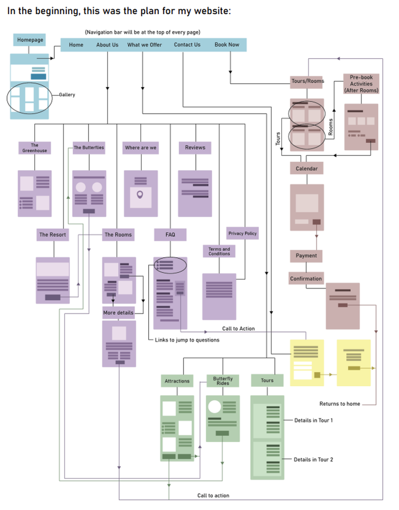
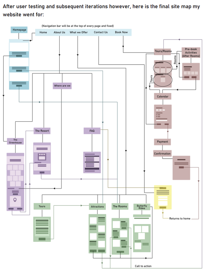
Site Map
|
|
