Purpose
Maskcount is an app that is part of the solution of using citizen science to provide a counting tool in order to leverage data on mask-wearing compliance across Victoria. It was created as part of the Govhack 2020 challenge, and was entered in the Victorian State Government’s Citizen Science, COVID-19 Economic/Social Recovery as well as AWS’s science tasker challenge.
Project
|
Details
The project aims to use data collected by citizens to demonstrate the proportion of those wearing masks compared to the total individuals observed within all postcodes.
I worked with a team of 5 for this project, and worked closely with another UX Designer to produce the user interface of the application. Full details of the project are as follows: https://hackerspace.govhack.org/projects/mask_count |
Layout Design
|
Due to time constraints and COVID-19, there was a pressing need to do low-fidelity virtual testing online. The other designer and I designed the layout of the user interface, and we worked closely to make the application interactable for users to test on Figma. We discussed about the experience of the user while navigating the app. Notable discussions include:
|
User Testing (Visuals)
|
The second round of user testing was done on the same users, and consisted on the similar questions asked for the low-fidelity user testing, apart from these other questions:
Users were generally satisfied with the application and they felt that the colours added were eye-catching and felt that they were more likely to use the application as a result. |
User Testing (Low-fi)
|
A total of 2 users who are also user interface/user experience designers were tested over zoom on the low-fidelity user interface.
Task: You are currently in a crowded area. You see 3 people wearing who are not wearing masks. Count the masks. Interview questions:
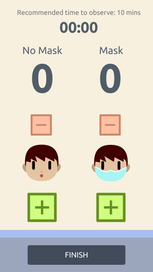
Generally, the users were satisfied with the application, and the task flow they did was smooth. One user stated that they felt that showing the number of masks in the end helped visualize their contribution, and increases their satisfaction for having contributed to a meaningful cause to combat COVID-19. The other user stated that the reminder for advice in the home page “would be nice” as it reminds users about social distancing guidelines as they could get caught up on counting masks that they forget to adhere to the rules. Both users felt that the timer is adequate for keeping time, although one suggested that the time should be counted down. For that, we decided on the recommended time to observe citizens (which is 10 minutes), and we decided to add the text on top of the timer. |
Visual Design
|
For the medium fidelity prototype, I focused more heavily on the colours and the design of the application, while the other UX designer focused on the content of the application.
As there was some difficulty finding royalty free assets that adhere to COVID-19, I made my own assets using Affinity Designer, and used a personal style on the assets to represent mask wearers and non mask wearers. For the non mask-wearers, care has to be given with designing their expression. It would be easy to villainize non mask-wearers based on their expression alone. Because of that, rather than give them a positive or negative expression, an 'o' shape was formed on their mouth instead, to indicate a neutral and non-judgemental position of the non mask-wearer.
For the background, I used more desaturated colours to add a touch of professionality to balance out the playfulness of the icons. I used various colours like beige and blue. The beige helps to make the app look brighter and less bleak while users count the masks, whereas the blue balances out the warmth of the beige and is mainly used for information purposes.
For the plus and minus signs, they have a warmer and brighter colour scheme to draw attention to them on the screen for users to click on. The bright colours and the colours being complementary will also be likely to draw visitors to the application. |